New York, New York, USA
Reflecting the refreshing nature of 7UP, Pepsico modernizes its look while maintaining a connection to the brand’s heritage in an effort to modernize the brand while maintaining its essence, focusing on visual appeal, sustainable practices, and refreshed marketing to cater to today’s consumer tastes.
The brand posits that life is always better when we choose moments that uplift us, and it was time to bring this timeless 7UP narrative forward.
The project has recently been awarded a 2023 Good Design Award by The Chicago Athenaeum: Museum of Architecture and Design and The European Centre for Architecture Art Design and Urban Studies.
To breathe new life and a fresh attitude into the brand, 7UP needed an updated Visual Identity System (VIS) and new packaging.
The restaged 7UP VIS represents a frame of mind and style that encompasses all that is refreshing, distinctive, and modern.
The previous brand identity of 7UP had been established seven years ago. Wanting to reach a younger audience, it was clearly time to update the brand’s positioning.
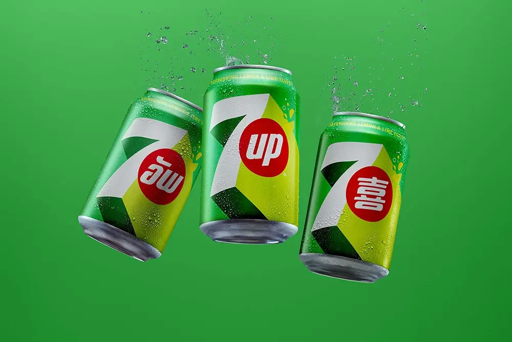
The new look and feel for the global 7UP brand had to be both timeless and modern, and carry design codes that would appeal to consumers across wide geographies and cultures.
In addition to these goals, as a part of the restage, 7UP Zero Sugar also needed to establish an intentional and unapologetic presence of its own while still maintaining an overall coherence established by the core brand.
So, the Design Team sought to create a look and feel for 7UP with a fresh presence that would cut through the clutter of the Carbonated Soft Drinks (CSD) category and ensure confident distinction from key competitors.
They wanted to elevate the visual world of 7UP with a big, bold, creative idea to shift the brand from feeling static and slightly nostalgic to positive, dynamic, and utterly refreshing.
To do that, they created a punchy, positive new design language to launch and share the “UPliftment” of 7UP with the world.
They developed compelling visuals that led consumers on a journey into the iconic brand world of 7UP and set the framework for building “UP” as a distinctive asset.
By owning UP as a concept, both visually and viscerally, the brand communicates that life is always better on the upside.
From the elegantly simple to the beautifully inventive, 7UP now makes this uplifting perspective seen as well as felt.
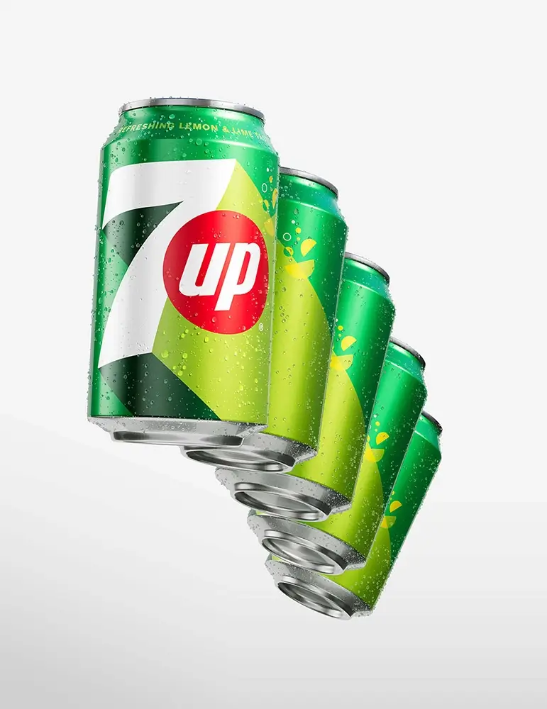
The new 7UP VIS employs bold contrast and refreshing colors to convey a sense of immediate clarity and upward-focused power.
The designers used a trio of vibrant green shades set against the clean white and commanding red of the 7UP logo. In order to distinguish between 7UP and 7UP Zero Sugar, they swapped the shades of green used in the background.

Project: 7UP Global Brand Restage
Designers: PepsiCo Design & Innovation, PepsiCo., Inc.
Manufacturer: PepsiCo., Inc.